http://en.wikipedia.org/wiki/Radar_chart
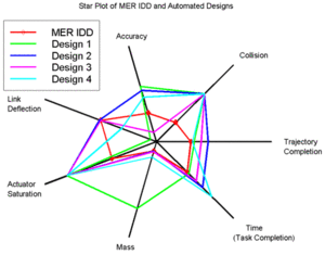
This plot is used to display multivariate data. Each star or point is a single peice of data that is linked together by lines. This makes it easy to view relative values between multiple plots. This is a NASA star plot dealing with the MER IDD robotic space arm.
GIS 3015 sp12 Mapblog
Tuesday, April 3, 2012
Stem and Leaf Plot
http://mainland.cctt.org/mathsummer/JosephBond/StemAndPlots/stem-and-leaf_std.htm
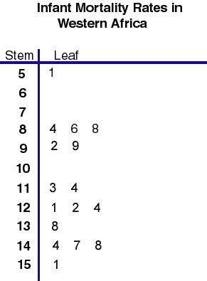
This plot type is used for displaying numerical quantitative data. It is used frequently in statistics. This specific map depicts infant mortality rates in Western Africa.
This plot type is used for displaying numerical quantitative data. It is used frequently in statistics. This specific map depicts infant mortality rates in Western Africa.
Box Plot
http://www.numeracy-bank.net/?q=t/stt/mwu/4
This Box and Whisker Plot shows the measurement of bone density between the two sexes. These graphs are good for showing outliers (even though this plot doesn't have any). They are mostly used in Math applications.
This Box and Whisker Plot shows the measurement of bone density between the two sexes. These graphs are good for showing outliers (even though this plot doesn't have any). They are mostly used in Math applications.
Histogram
http://labwrite.ncsu.edu/res/gh/gh-bargraph.html
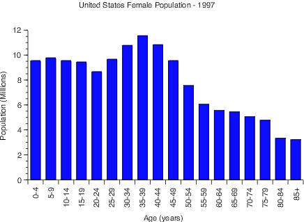
This Histogram depicts the United States female population in 1997. Bars are used to show the distribution of ages in the population.
This Histogram depicts the United States female population in 1997. Bars are used to show the distribution of ages in the population.
Parallel Coordinate Graph
http://hci.stanford.edu/jheer/files/zoo/
This Parallel coordinate graph deals with vehicles from 1982. These complex maps allow multiple variables to be analyzed in the second dimension.
This Parallel coordinate graph deals with vehicles from 1982. These complex maps allow multiple variables to be analyzed in the second dimension.
Triangular Plot
http://www.dplot.com/triangle-plot.htm
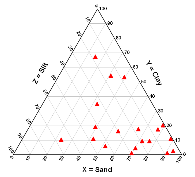
The Triangle plot shows three different variables on an equilateral triangle. This plot has clay, silt, and sand as its axises. The plot can be used to compare and contrast three different variables.
The Triangle plot shows three different variables on an equilateral triangle. This plot has clay, silt, and sand as its axises. The plot can be used to compare and contrast three different variables.
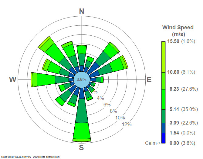
Wind rose
http://en.wikipedia.org/wiki/File:Wind_rose_plot.jpg
This is a Wind rose for La Guardia airport in New York 2008. The spokes show the direction and speed of the wind on average throughout the year. The wind here blows the strongest south.
This is a Wind rose for La Guardia airport in New York 2008. The spokes show the direction and speed of the wind on average throughout the year. The wind here blows the strongest south.
Subscribe to:
Comments (Atom)
