Tuesday, April 3, 2012

Star Plot

http://en.wikipedia.org/wiki/Radar_chart
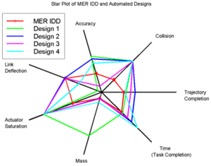
This plot is used to display multivariate data. Each star or point is a single peice of data that is linked together by lines. This makes it easy to view relative values between multiple plots. This is a NASA star plot dealing with the MER IDD robotic space arm.

Stem and Leaf Plot

http://mainland.cctt.org/mathsummer/JosephBond/StemAndPlots/stem-and-leaf_std.htm
This plot type is used for displaying numerical quantitative data. It is used frequently in statistics. This specific map depicts infant mortality rates in Western Africa.

Box Plot

http://www.numeracy-bank.net/?q=t/stt/mwu/4
This Box and Whisker Plot shows the measurement of bone density between the two sexes. These graphs are good for showing outliers (even though this plot doesn't have any). They are mostly used in Math applications.

Histogram

http://labwrite.ncsu.edu/res/gh/gh-bargraph.html
This Histogram depicts the United States female population in 1997. Bars are used to show the distribution of ages in the population.

Parallel Coordinate Graph

http://hci.stanford.edu/jheer/files/zoo/
This Parallel coordinate graph deals with vehicles from 1982. These complex maps allow multiple variables to be analyzed in the second dimension.

Triangular Plot

http://www.dplot.com/triangle-plot.htm
The Triangle plot shows three different variables on an equilateral triangle. This plot has clay, silt, and sand as its axises. The plot can be used to compare and contrast three different variables.

Wind rose

http://en.wikipedia.org/wiki/File:Wind_rose_plot.jpg
This is a Wind rose for La Guardia airport in New York 2008. The spokes show the direction and speed of the wind on average throughout the year. The wind here blows the strongest south.

Climograph

http://www.colorado.edu/geography/extra/geogweb/bouldercreek-2/preview/page2.html
This graph is used by meterologists and climatologists; it plots the weather. More specifically it shows precipatation and temperature over a time period. This map shows data for Boulder, Colorado.

Population Profile

http://2010.census.gov/
This chart shows the 2010 census data for Washington DC. The chart shows the population with ages as the function. It seperates male and female data sets.

Scatter Plot

http://www.itl.nist.gov/div898/handbook/pmd/section6/pmd622.htm
This map shows the data from the Alaska Pipeline Ultrasonic calibration results. It compares two variables, in this case lab vs field defect size.

Index Value Plot

http://www.worldclimatereport.com/index.php/2010/07/29/recent-news-from-antarctica/
The Index Value Plot is used to identify and map data outliers. This map shows the snowmelt in the southern hemisphere and the melting index. These plots can be handy for climate change scientists.

Accumulated Line Graph

http://library.thinkquest.org/05aug/00282/over_measure1.htm
This Accumulated Line Graph includes the Lorenz Curve. The data represented is income inequality in 1978. The straight orange line is where Lorenz thought the utopian society should be and the blue B curve is where the US is. According to this map everyone does not have equal income, but at least no one has all of the money.

Bilateral Bar Graph

http://www1.eere.energy.gov/vehiclesandfuels/facts/2008_fotw546.html
This Bilateral Bar Graph contrasts the global auto sales from 2007 to 2008. It has both positive and negative bars and a central axis of 0%.

Nominal Area Choropleth Map

http://www.vbmap.org/europe-maps-9/world-maps-europe-33/
This Nominal Area Choropleth map shows Western Europe and only shows names. This means that there is no numbers involved so the data is Qualititative. Different colors are used to show different states, not different data so its a Nominal map.

Unstandardized Choropleth Map

https://www.e-education.psu.edu/geog485vba/l7_p7.html
Even though this map is of the same data as the standaradized choropleth map it uses the raw data to show state population. This map hasnt been normalized or the data average so therefore its a Unstandardized Choropleth Map.

Monday, April 2, 2012

Standardized Choropleth Map


https://www.e-education.psu.edu/geog485vba/l7_p7.html
Standardized Choropleth Maps use set ranges to break down the variable into percentages and averages. This allows the data to be mapped easily and simply. The map above shows US population in 1999 per sqaure mile.

Univariate Choropleth Map


http://www.gisdevelopment.net/application/urban/overview/urbano0032.htm
This Choropleth map only shows one variable. They are the most simple type of Choropleth and are very frequently used. This map shows some sort of difference between counties.

Bivariate Choropleth Map


http://rkpjrhist615.wordpress.com/category/geography-310/
This type of map represents two data sets with different symbols, in this case colored squares and gas pumps. It is used to compare and contrast the variables.

Unclassed Choropleth Map

http://www.math.yorku.ca/SCS/Gallery/milestone/thumb5/popup/bssn1_popup1-18.htm
This map uses a scale of shading instead of specific values to represent data. The map above is one of the first Unclassed Choropleth maps and was created in France 1826. These maps aren't really used by modern cartographers.

Classed Choropleth Map


The Classed Choropleth Map uses averages of water withdrawals in 2000. It also exists within boundaries of the US.

Range Graded Porportional Circle Map

http://mapmaker.rutgers.edu/355/
This map is very similar to other proportional circle maps except that the circles have a range of values. They cant be bigger or smaller than values they are given.

Continuously Variable Proportional Circle Map

http://similaritymatrix.blogspot.com/2009/11/continuously-variable-proportional_29.html
This CVPC map uses circles to represent data, in this case voter preference in the 2008 campaign. This changed as the results came in.

Digital Elevation Model

http://www.sciencegl.com/gis_dem/index.html
This DEM map shows the elevation of a landscape in three dimensions. It uses vectors and was probably created with remote sensing equipment.

Digital Line Graph

http://www.outintheboonies.com/Tosohatchee/
A DLG map is a vector map distributed by the USGS. This one shows a nature reserve and is on a 1:24000 scale. These maps are used to GIS.

Digital Raster Graphic

http://www.mapmart.com/Products/TopographicalMaps/SeamlessDRG.aspx
This DRG has been scanned by the USGS and projected onto the Universal Mercator Projection. It is a topographic map.

Isopleths

http://www.unc.edu/~meagsmch/ozone/o3isopleth.htm
An Isopleth is any contour line that connects points of equal value to each other. The map I chose was an ozone thickness map which uses the lines to represent the areas of thickness.

Isopachs

http://www.glossary.oilfield.slb.com/DisplayImage.cfm?ID=114
Isopachs are used to show the thickness of rock layers. They use contour lines to connect points of equal thickness. This map shows the location of oil and the rock around it; these maps are used often in mining.

Isohyets

http://www.aquaplan.de/public_papers/aquazis_en/Isohyets080.html
This shows Isohyets in Germany. Isohyets are contour lines that connect points that receive equal rainfall. This is highly useful to farmers.

Isotachs

http://www.crh.noaa.gov/lmk/soo/docu/basicwx.php
Isotachs are contour lines connecting points of equal wind speed. The map shown above illustrates the wind speed of the Jet Stream across the US.

Isobars

http://www.weatheronline.co.uk/reports/wxfacts/Isobars-on-surface-maps.htm
Isobars are contour lines that are used to represent a line of constant pressure. The map above is a weather map that shows the different air pressures with Isobars.

LIDAR

http://www.saic.com/geospatial/modeling/lidar-urban-modeling.html
LIDAR or Light Detection and Ranging uses lasers to remotely map an area. It offers scientists with very accurate and quick maps. The image above is a city mapped with LIDAR.

Doppler Radar

http://kwilklab.wordpress.com/2011/04/15/polarimetric-doppler-radar-rocks-the-house/
This Doppler Radar image shows a hurricane barreling into Florida. The radar gives modern meteorologists a great tool for accurately measuring the velocity of objects at a distance by shooting microwaves at it and analyzing the bounce back.

Black & White aerial photo

http://www.culture24.org.uk/places+to+go/north+west/liverpool/art28314
This picture shows Liverpool in 1941. Remote photographs allow cartographers and city planners to easily create maps.

Infrared Aerial Photo

http://www.aerialarchives.com/infrared.htm
This photo depicts some landscape in which there is a variation in the light spectrum. Aerial photography is great a great remote sensing tool for GIS.

Cartographic Animation Map

http://uwacadweb.uwyo.edu/JSHINKER/animations/global/


This animated map shows the variation of the air temperature across the globe every month of the year. It is represented by color changes and the animation.

Statistical Map

http://www.skyscrapercity.com/showthread.php?t=1075987
This statistical map shows the variation in the growth in mega-cities all over the world. It uses circles to represent the stats.

Cartogram

http://www-personal.umich.edu/~mejn/cartograms/
This Cartogram represents the worlds population. Its an area cartogram because the representation of countries populations in proportion to their land. This results in distortion.

Flow Map

http://www.mundi.net/maps/maps_014/telegeography.html
Flow maps show the movement of objects in an area. This Flow map shows Western Europe and the movement of voice data from country to country. Its interesting to see that Germany and England use the most.

Isoline Map

http://giscommons.org/?page_id=18
This Isoline map probably shows temperature, air pressure (isobars), or maybe even rainfall amounts. The lines link up points of the same value.

Proportional Circle Map

http://www.neiu.edu/~tpoconno/geography/377/377home.htm
This map is a proportional circle map because it simply uses circles to represent a data value. These circles vary on size due to the different data points.

Choropleth Map

http://hci.stanford.edu/jheer/files/zoo/
This Choropleth map shows the levels of obesity across the United States. It uses different shades of colors to distinguish the percentage of obesity per state.

Dot Distribution Map

http://www.bbc.co.uk/scotland/learning/bitesize/standard/geography/population/distribution_density_rev1.shtml
This Dot Distribution Map shows the population distribution of the world. It is a One-to-Many type of DDM as each dot represents a million people. It shows how unevenly the world is populated.

Propaganda Map

http://publicdiplomacypressandblogreview.blogspot.com/2011/11/november-20.html
This Propoganda map depicts Europe pre-WWII. It appears to be a Nazi propaganda map showing all of the other states ganging up on Germany after WWI. This was used as a tool to persuade the people of Germany to elect a certain party. It distorts the scale and the design is very subjective.

Hypsometric Map

http://www.acsu.buffalo.edu/~dbertuca/maps/cat/map-portion-images.html
Hypsometric Tint maps show elevations using a range of colors. Each shade of color represents a different level on this map as shown by the color bar.

PLSS Maps

http://gis.nwcg.gov/giss_2006/cd_contents.html
This Public Land Survey System map depicts the states that use the system in color and shows their prime meridian(s). The map of the US allows people to identify the meridian and then break down an area into small sections such as townships and so on.

Cadastral Map

http://www.cadastraltemplate.org/countrydata/nl.htm
This Cadastral map shows a county in the Netherlands. It consists of boundaries and parcels with text in them to identify ownership.

Thematic Map

http://www.infousagov.com/thematicmap.asp
This map of the United States focuses on the Theme of new business. This map can be categorized as a univariate map since it deals with the same kind of non-locational data. Specifically it is a thematic choropleth map.

Topographic Map

http://www.uml.edu/tsongas/Curriculum_Materials/Activities/Map.html
This Topographic map shows a set of hills or mountains. It shows relief by using contour lines. It actually shows elevation with two different maps to give the viewer more information.

Planimetric Map

http://egsc.usgs.gov/nimamaps/topo.html
This Planimetric map Iraq. It is a horizontal map and shows boundaries, cities, railroads, roads, airports,seas, rivers, and lakes without topographical features.

Mental Map

http://soa.utexas.edu/work/eaejp/methods.htm
This Mental map depicts the area around a 6th graders school. It qualifies as a mental map because it was drawn purely by the students perception. The map is a perfect representation of a mental map and shows evidence of human spatial distortion.