http://www.colorado.edu/geography/extra/geogweb/bouldercreek-2/preview/page2.html
This graph is used by meterologists and climatologists; it plots the weather. More specifically it shows precipatation and temperature over a time period. This map shows data for Boulder, Colorado.
Tuesday, April 3, 2012
Population Profile
http://2010.census.gov/
This chart shows the 2010 census data for Washington DC. The chart shows the population with ages as the function. It seperates male and female data sets.
This chart shows the 2010 census data for Washington DC. The chart shows the population with ages as the function. It seperates male and female data sets.
Scatter Plot
http://www.itl.nist.gov/div898/handbook/pmd/section6/pmd622.htm
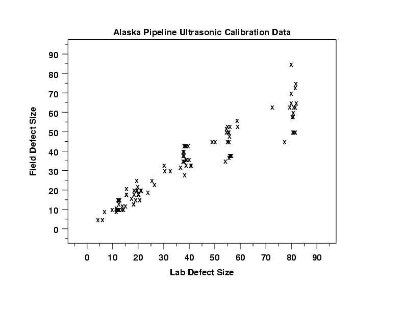
This map shows the data from the Alaska Pipeline Ultrasonic calibration results. It compares two variables, in this case lab vs field defect size.
This map shows the data from the Alaska Pipeline Ultrasonic calibration results. It compares two variables, in this case lab vs field defect size.
Index Value Plot
http://www.worldclimatereport.com/index.php/2010/07/29/recent-news-from-antarctica/
The Index Value Plot is used to identify and map data outliers. This map shows the snowmelt in the southern hemisphere and the melting index. These plots can be handy for climate change scientists.
The Index Value Plot is used to identify and map data outliers. This map shows the snowmelt in the southern hemisphere and the melting index. These plots can be handy for climate change scientists.
Accumulated Line Graph
http://library.thinkquest.org/05aug/00282/over_measure1.htm
This Accumulated Line Graph includes the Lorenz Curve. The data represented is income inequality in 1978. The straight orange line is where Lorenz thought the utopian society should be and the blue B curve is where the US is. According to this map everyone does not have equal income, but at least no one has all of the money.
This Accumulated Line Graph includes the Lorenz Curve. The data represented is income inequality in 1978. The straight orange line is where Lorenz thought the utopian society should be and the blue B curve is where the US is. According to this map everyone does not have equal income, but at least no one has all of the money.
Bilateral Bar Graph
http://www1.eere.energy.gov/vehiclesandfuels/facts/2008_fotw546.html
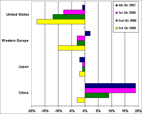
This Bilateral Bar Graph contrasts the global auto sales from 2007 to 2008. It has both positive and negative bars and a central axis of 0%.
This Bilateral Bar Graph contrasts the global auto sales from 2007 to 2008. It has both positive and negative bars and a central axis of 0%.
Nominal Area Choropleth Map
http://www.vbmap.org/europe-maps-9/world-maps-europe-33/
This Nominal Area Choropleth map shows Western Europe and only shows names. This means that there is no numbers involved so the data is Qualititative. Different colors are used to show different states, not different data so its a Nominal map.
This Nominal Area Choropleth map shows Western Europe and only shows names. This means that there is no numbers involved so the data is Qualititative. Different colors are used to show different states, not different data so its a Nominal map.
Subscribe to:
Posts (Atom)


